# Introduction
The source code used in this guide can be found on Github (opens new window).
For our quick start tutorial, we will create a small form containing only a PropertyGrid. It will display several properties taken here and there from the available object instances of the application and added on the fly. Then we will customize them to make the grid a pleasant to use tool for the end-user. Almost all the basic features of SPG will be shown in this sample.
SPG can be filled like the Microsoft PropertyGrid does, using SelectedObject on a class instance. This method uses reflection do discover at run-time all the browsable properties of the targeted class. While this is a powerful way to go, it lacks all the dynamic aspect of filling a grid. SPG also offers this mode but it is really recommended to use the dynamic mode instead. Under this mode, all of its features are available.
Microsoft Visual Studio 2022 is used to produce the code shown through this document.
# First steps
- File -> New -> Project...
- Select the Windows Forms App template. Click Next.
- Name your project (QuickStart will be used in this document) and choose a location. Click Next.
- Select .Net 6 as the Framework. Click Create.
- In Solution Explorer, right-click your project and select Manage Nuget Packages...
- In the Browse tab, search from VisualHint. Select VisualHint.SmartPropertyGrid-net6 and click Install. Accept the license.
Now we will create a derived class of the PropertyGrid and put it on our form:
- In the Solution Explorer, right click on the QuickStart project.
- Click Add -> Class...
- Name the Class as MyPropertyGrid, click Add.
- Modify the code to make the class public and derive it from PropertyGrid.
- Resolve the name PropertyGrid so that it adds a using directive (in the rest of the document, I’ll let you resolve this kind of stuff).
using System;
using VisualHint.SmartPropertyGrid;

namespace QuickStart
{
    public class MyPropertyGrid : VisualHint.SmartPropertyGrid.PropertyGrid
    {
    }
}
- From the toolbox, drag a MyPropertyGrid on the form (resize the grid and the form as in the next image).
- Modify the constructor of the form:
public Form1()
{
    InitializeComponent();

    myPropertyGrid1.Initialize();
}
- And add the Initialize method to MyPropertyGrid.
- Compile and run. You will get the following empty PropertyGrid:

# Categories
Adding a root category is straightforward. In the MyPropertyGrid.Initialize() method, add the following line:
PropertyEnumerator catEnum = AppendRootCategory(1, "Application");
This brings two notions: property identifiers and property enumerators.
An identifier doesn’t need to be unique. It is simply an integer stored in the property that you can use to retrieve it during a search operation. So usually you will make it unique, but again this is not mandatory.
A property enumerator is an indirect reference to a property in the grid. Its primary function is to navigate through the hierarchy of properties. In our example, we will shortly use the enumerator returned by AppendRootCategory to add children to the category. An enumerator can also be stored like property identifiers for future comparison in notification methods for example. From an enumerator, you can access the property and therefore its identifier.
We won’t create them in this sample, but subcategories are as easily created with AppendSubCategory.
This is now the time to fill the grid with valuable informations. For each property, we must ask ourselves:
- What is the data to be shown and how can I link the PropertyGrid to it?
- How will it be displayed?
- How will the user interact with the property value?
All three steps are of course inter-related. The next section talks about the first point. The second point will be addressed when dealing with Property Looks. And finally, Property Feels will solve the third point.
# Managed properties
The term “managed” has nothing to do here with managed or unmanaged code. Instead, this is a way to say that the row we will create in the grid has no external link with a .net property and therefore the SPG library must manage (host) it completely. This is something not feasible in the Microsoft grid and this is what we will do now because we have no other choice for the property we want to create.
Under the “Application” node I want to add the static value returned by the property Application.AllowQuit. Add this code to the Initialize method:
PropertyEnumerator propEnum = AppendManagedProperty(catEnum, 2, "AllowQuit",
typeof(bool), Application.AllowQuit, "", new ReadOnlyAttribute(true));
Let’s see what is done exactly with this call:
Because the property we create is managed, we call AppendManagedProperty instead of the usual AppendProperty. The first parameter is an enumerator on the parent property, in our case the root category we created earlier. Then comes an arbitrary identifier. The third parameter is the property label. Here we call it like the actual .net property. The fourth parameter is the type of the property and the fifth parameter is the initial value. The next empty string means no comments. The last parameter tells SPG to create a readonly property. By doing this we simulate the fact that Application.AllowQuit has only a get method. The returned value is an enumerator on the newly created property.
We are done with this one because AllowQuit doesn’t change during the lifetime of the application. If it was changing, we would have to handle the link between this simulated property and the real one. This is necessary because the target property is static. SPG will handle automatically those static properties in the future but right now we must simulate such properties.
You understand that with managed properties we can add values that have no link with any class or instances. It means that the following code is correct:
AppendManagedProperty(catEnum, id, "MyInteger", typeof(int), 4, "");
The above code avoids creating a variable in the client application to store the integer. SPG will create an internal .net property for it, exactly like for the AllowQuit data.
To finish with managed properties, we add a new row for Application.UseWaitCursor:
AppendManagedProperty(catEnum, 3, "Use wait cursor", typeof(bool),
Application.UseWaitCursor, "");
It creates a new property with the current value of UseW*aitCursor and does not create a link to the corresponding property in the Application instance. So, if the user changes its value from inside the grid, it will have no effect at all. We will see how we can go around this problem with Notifications.
# “Normal” properties
Let’s come back to regular .net properties. We will now create several entries concerning the form. And we need a category to encapsulate them:
catEnum = AppendRootCategory(4, "Form");
The first property will reflect the background color of the form:
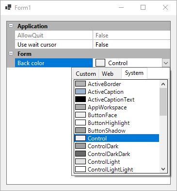
AppendProperty(catEnum, 5, "Back color", ParentForm, "BackColor", "");
As you can see, we create a readable label for the property and we link it to the BackColor property of the target instance ParentForm. Compile and run the sample. You will see a ready to use color property:
Now we will add a second property to be able to change the size of the form:
propEnum = AppendProperty(catEnum, 6, "Size", ParentForm, "Size", "");
This creates the usual property group: a Size parent and two children for Width and Height. Because it is created collapsed by default, let’s expand it right now:
ExpandProperty(propEnum, true);
At last, we want to play with layered windows, so we need the Opacity property. Instead of appending the property, we will insert it before Size. The Initialize method at this stage will look like this:
public void Initialize()
{
    PropertyEnumerator catEnum = AppendRootCategory(1, "Application");

    PropertyEnumerator propEnum = AppendManagedProperty(catEnum, 2, "AllowQuit",
        typeof(bool), Application.AllowQuit, "", new ReadOnlyAttribute(true));

    AppendManagedProperty(catEnum, 3, "Use wait cursor", typeof(bool),
        Application.UseWaitCursor, "");

    catEnum = AppendRootCategory(4, "Form");

    AppendProperty(catEnum, 5, "Back color", ParentForm, "BackColor", "");

    propEnum = AppendProperty(catEnum, 6, "Size", ParentForm, "Size", "");
    ExpandProperty(propEnum, true);

    propEnum = InsertProperty(propEnum, 7, "Opacity", ParentForm, "Opacity", "");
}
You can see that InsertProperty takes the enumerator on the next sibling property instead of a parent property.
AppendProperty and InsertProperty can take an additional parameter. In fact, an array of optional attributes that can be passed as a variable argument list. You remember that the PropertyGrid can also be constructed in the old good way with SelectedObject. In that case, a way to customize the properties is to decorate them with attributes. Because the internal code of SPG tends to be generic, the same attributes can be passed when you use dynamic methods. They can be set on the properties themselves as metadata or passed to the methods we saw in this section.
Under the Form node, we have the opacity and size properties that can be set only as text. During the next sections our goal will be to change that to give the user better edition capabilities. Our goal will be to supply a trackbar for the opacity and updown buttons for the width and height. Anyway, here is how our program looks right now:

# Interaction
The Microsoft PropertyGrid introduces the concept of UITypeEditors to allow the developer to create his own ways to interact with a property value. This is a powerful concept in essence but in practice it is limited to dropdown forms, modal forms and textboxes. While you can still display what you want in a form, an inplace control would be more suitable in most cases. For example, why show a trackbar in a dropdown window when it can be placed in the value itself?
Speaking of trackbar, this is exactly what we will do first. As said in the previous section, we will modify the Opacity property to show a trackbar at edit time, like this:

Our goal is to make the trackbar change the underlying value in realtime (change while scrolling the cursor).
But before beginning, we must realize that a trackbar only takes integer values. So, we have a problem here because the Opacity, even if displayed as integer percentage values by its TypeConverter, is internally represented by a Single. The flexibility of SPG will help.
We add an internal variable for the opacity:
public int Opacity { get; set; }
It will act as a proxy of the form Opacity property. It takes a value between 0 and 100 and we will ensure later that there is some kind of validation on the property.
We modify the target instance of the property:
Opacity = (int)(ParentForm.Opacity * 100.0);
propEnum = InsertProperty(propEnum, 7, "Opacity", this, "Opacity", "");
And now the most important part: the following line of code assigns a new feel to the property to tell SPG to use a trackbar for the edition of the value:
propEnum.Property.Feel = GetRegisteredFeel(FeelTrackbarEdit);
As you can see, we requested the “trackbar” feel (capable of also displaying a textbox) by using the identifier FeelTrackbarEdit and we assigned it to the Feel property of the newly created Property. We now have the desired effect but we still miss three things: first, this.Opacity is not changed in realtime when the cursor is scrolled, the property is not even linked to the parent form Opacity and at last it’s still possible to enter an invalid value like 200 in the textbox. First two issues will be addressed in the next section because we need to be notified about certain events to be able to fine-tune the behaviour of our inplace control at will. The validation process will be seen later.
For the Size child properties, we can’t assign a feel like this. The property we are creating is the parent property and not each individual Width and Height. We will also need to wait for the next section to be able to set the feels.
A last note about feels and the ReadOnly status. When a value is readonly, SPG offers two choices: it can show a readonly textbox to let the user select and copy the value or it does nothing as if there was no feel on the property. This is controllable with the PropertyGrid.ReadOnlyVisual property that should be set once and for all while initializing the control.
SPG allows you to set the readonly attribute at runtime and to override the one in the metadata. Let’s create a new property by putting this code after the creation of the Opacity property:
propEnum = AppendManagedProperty(catEnum, 10, "Size readonly", typeof(bool), false, "");
propEnum.Property.Feel = GetRegisteredFeel(FeelCheckbox);
propEnum.Property.Look = new PropertyCheckboxLook();
We want it to control the readonly status of the Size property above it, so in the OnPropertyChanged handler (see Notifications below) we add:
...
else if (e.PropertyEnum.Property.Id == 10)
{
    PropertyEnumerator propEnum = FindProperty(6);
    propEnum.Property.Value.ReadOnly = (bool)e.PropertyEnum.Property.
        Value.GetValue();
}
This code will search for the Size property and modify its status based on the value of the checkbox.
To finish this section, change PropertyGrid.ReadOnlyVisual to ReadOnlyFeel and see what it gives...
# Notifications
In a previous section, we added a property to be able to edit the Application.UseWaitCursor value. But we realized that with the current version of SPG, static variables couldn’t be handled automatically. Let’s see the changes that are needed.
We first create a variable acting as a proxy:
private bool _useWaitCursor;

public new bool UseWaitCursor
{
    set { _useWaitCursor = value; }
    get { return _useWaitCursor; }
}
The creation of the property must be modified like this:
UseWaitCursor = Application.UseWaitCursor;
AppendProperty(catEnum, 3, "Use wait cursor", this, "UseWaitCursor", "");
This creates a non managed property, as we did for the background color except that this time the target instance is the PropertyGrid itself. But the problem is not solved yet since modifying this property value won’t affect UseWaitCursor of the form.
So, let’s introduce our first and most used event: OnPropertyChanged. You certainly know about it from the Microsoft grid. Of course, the signature will be a bit different.
We want to update our actual property when the proxy changes.
protected override void OnPropertyChanged(VisualHint.SmartPropertyGrid.PropertyChangedEventArgs e)
{
    if (e.PropertyEnum.Property.Id == 3)
        Application.UseWaitCursor = UseWaitCursor;

    base.OnPropertyChanged(e);
}
Since we are here, you remember the form Opacity in the previous section? We can now link our proxy variable to the actual opacity by adding the following code in OnPropertyChanged:
...
else if (e.PropertyEnum.Property.Id == 7)
    ParentForm.Opacity = Opacity / 100.0;
Both UseWaitCursor and Opacity are now usable. But we still need to turn the trackbar into a realtime one. This will allow me to introduce another notification:
protected override void OnInPlaceCtrlVisible(InPlaceCtrlVisibleEventArgs e)
{
    if (e.PropertyEnum.Property.Id == 7)
        (e.InPlaceCtrl as PropInPlaceTrackbar).RealtimeChange = true;

    base.OnInPlaceCtrlVisible(e);
}
This method is called each time an inplace control is made visible. In this case we make sure that the Opacity property is the active one and we then change one of the properties of the trackbar inplace control.
Back to the Size property: we want to act on the Width and Height properties to assign the proper feel. We can do this only when these child properties have been created. We will use another notification method. The PropertyCreated event is fired when a new property has been created even for the ones that we don’t create directly:
protected override void OnPropertyCreated(PropertyCreatedEventArgs e)
{
    if (e.PropertyEnum.Parent.Property != null)
    {
        if (e.PropertyEnum.Parent.Property.Id == 6)
            e.PropertyEnum.Property.Feel = GetRegisteredFeel(FeelUpDown);
    }

    base.OnPropertyCreated(e);
}
Because the event is triggered for a parent property when all its descendants have already been created, we could also write:
protected override void OnPropertyCreated(PropertyCreatedEventArgs e)
{
    if (e.PropertyEnum.Property.Id == 6)
    {
        PropertyEnumerator childEnum = e.PropertyEnum.Children;
        childEnum.Property.Feel = GetRegisteredFeel(
           VisualHint.SmartPropertyGrid.PropertyGrid.FeelEditUpDown);
        childEnum.MoveNext();
        childEnum.Property.Feel = GetRegisteredFeel(
           VisualHint.SmartPropertyGrid.PropertyGrid.FeelEditUpDown);
    }

    base.OnPropertyCreated(e);
}
In this case we monitor the parent and then we access each child by using a sibling enumerator.
We will now see how notification methods can help having some very dynamic properties. And for this we must create two new properties:
propEnum = AppendManagedProperty(catEnum, 8, "Chess piece", typeof(string), "Pawn", "");
propEnum.Property.Feel = GetRegisteredFeel(FeelList);

propEnum = AppendManagedProperty(catEnum, 9, "Incremented value", typeof(double), 1.2, "");
propEnum.Property.Feel = GetRegisteredFeel(FeelEditUpDown);
The first property is a combobox that must display all chess pieces (with icons that we will add in the next section). But as you can see, we created a managed property and the underlying type is a string, so right now the property has no idea about the allowed values. The second property is a simple double value that can be incremented/decremented by one but we would like to use a custom increment. These requirements can be addressed with the two following notification methods:
protected override void OnDisplayedValuesNeeded(DisplayedValuesNeededEventArgs e)
{
    if (e.PropertyEnum.Property.Id == 8)
        e.DisplayedValues = new string[] {
            "King", "Queen", "Rook", "Bishop", "Knight", "Pawn" };

    base.OnDisplayedValuesNeeded(e);
}

protected override void OnPropertyUpDown(PropertyUpDownEventArgs e)
{
    if (e.PropertyEnum.Property.Id == 9)
        e.Value = (Double.Parse(e.Value) + (e.ButtonPressed ==
            PropertyUpDownEventArgs.UpDownButtons.Up ? 0.1 : -0.1)).ToString();

    base.OnPropertyUpDown(e);
}
The first method is called when the values shown in the listbox are not known by the library. The second one returns the correct double value based on the button that was pressed.
I must give a word of caution. We have created a new property that uses an updown inplace control (we already have some for the width and height properties). Because each kind of inplace control is a singleton we must be cautious in OnInPlaceCtrlVisible to set the correct settings for the singleton. For example, if we expect our new property not to have realtime changes we must set it explicitly because it is set to true for the Width and Height properties by default:
else if ((e.PropertyEnum.Parent.Property != null) && (e.PropertyEnum.Parent.Property.Id == 6))
    (e.InPlaceCtrl as PropInPlaceUpDown).RealtimeChange = true;
else if (e.PropertyEnum.Property.Id == 9)
    (e.InPlaceCtrl as PropInPlaceUpDown).RealtimeChange = false;
# Appearance
# Property customizations
The row containing a property (its label and its value) can be customized as you usually expect: background and foreground colors, font and icon. To this list can be added: the height of a multiline property and the presence of a checkbox in the label area to let the user enable/disable a property and its descendants.
Let’s say you don’t like the color used for our first disabled property and you want to improve the accessibility of the control, you can do this:
propEnum.Property.DisabledForeColor = Color.Firebrick;
This change can be done on the value only:
propEnum.Property.Value.DisabledForeColor = Color.Firebrick;
# Value customizations
The way a data represented in the value column of a property is displayed can be completely customized. This is possible by applying a PropertyLook to the property. This is highly related to the presence of a PropertyFeel because usually these two entities of the library will draw the data in the same manner. So, we can express as a general rule that a look draws the property value when it is not selected and a property feel does it when the property is selected for edition (additionally to its first role which is editing the value).
In our sample, we will modify the property UseWaitCursor to be a little less “programming language” like. By changing its look and its feel, the end-user will feel better. Here is the corresponding block of code:
UseWaitCursor = Application.UseWaitCursor;
propEnum = AppendProperty(catEnum, 3, "Wait cursor", this, "UseWaitCursor", "");
propEnum.Property.Feel = GetRegisteredFeel(FeelCheckbox);
propEnum.Property.Look = new PropertyCheckboxLook();
And because the string “true” and “false” are not user friendly, a specific attribute can be set on the property to change them:
[PropertyValueDisplayedAs(new string[] { "Use", "Don't use" })]
public new bool UseWaitCursor {
I will now show you how we could use the color property we created at the beginning of this quick tutorial to set a background color for the form as well as its opacity. Exactly like above we use the proper look and feel:
FormBackColor = ParentForm.BackColor;
propEnum = AppendProperty(catEnum, 5, "Back color", this, "FormBackColor", "",
    new PropertyDropDownContentAttribute(typeof(AlphaColorPicker)));
propEnum.Property.Feel = GetRegisteredFeel(FeelList);
propEnum.Property.Look = new PropertyAlphaColorLook();
The look that is used here displays a color with transparency in a box. You noticed that we were obliged again to create a proxy variable to hold the back color because the form BackColor won’t accept a value with transparency:
private Color _backColor;

public Color FormBackColor
{
    get { return _backColor; }
    set { _backColor = value; }
}
Although we are in a section about appearance, we must still tune the behaviour of our property:
protected override void OnPropertyChanged(VisualHint.SmartPropertyGrid.PropertyChangedEventArgs e)
{
    if (e.PropertyEnum.Property.Id == 3)
        Application.UseWaitCursor = UseWaitCursor;
    else if (e.PropertyEnum.Property.Id == 7)
    {
        ParentForm.Opacity = (double)Opacity / 100.0;
        FormBackColor = Color.FromArgb((int)((double)Opacity / 100.0 * 255.0), FormBackColor);
    }
    else if (e.PropertyEnum.Property.Id == 5)
    {
        ParentForm.Opacity = FormBackColor.A / 255.0;
        Opacity = (int)(ParentForm.Opacity * 100.0);
        ParentForm.BackColor = Color.FromArgb(FormBackColor.R, FormBackColor.G,
            FormBackColor.B);
    }

    base.OnPropertyChanged(e);
}
At last, we want to set some fancy icons to our chess set listbox:

So, let’s add some images under resources:
- In the solution explorer right click the QuickStart project.
- Click Add -> New item...
- Click Resources File, name it MainResources and click Add.
- Double click MainResources.resx
- Add six small images in the Images section.
Since our property is dynamic (we added the listbox items in OnDisplayValueNeeded), we will also add our icons in a notification method. They could have also been added at creation time.
protected override void OnPropertyCreated(PropertyCreatedEventArgs e)
{
    ...
    if (e.PropertyEnum.Property.Id == 8)
    {
        var il = new ImageList();
        var resourceManager = new ResourceManager(
            "QuickStart.MainResources", Assembly.GetExecutingAssembly());
        il.ColorDepth = ColorDepth.Depth32Bit;
        il.Images.Add((Bitmap?)resourceManager.GetObject("king"));
        il.Images.Add((Bitmap?)resourceManager.GetObject("queen"));
        il.Images.Add((Bitmap?)resourceManager.GetObject("rook"));
        il.Images.Add((Bitmap?)resourceManager.GetObject("bishop"));
        il.Images.Add((Bitmap?)resourceManager.GetObject("knight"));
        il.Images.Add((Bitmap?)resourceManager.GetObject("pawn"));
        e.PropertyEnum.Property.Value.ImageList = il;
    }
    ...
}
Compile and experiment. This gives you an insight of what can be done with looks and feels. SPG is very flexible and lets you develop your own ones.
# Global customizations
The overall appearance of the grid can be changed by two different ways.
First you can use the available properties of the PropertyGrid class. For example, we add the toolbar and the comments area with:
ToolbarVisibility = true;
CommentsVisibility = true;
The layout is slightly changed with this code:
CommentsHeight = 50;
LabelColumnWidthRatio = 0.4;
The second way to change the appearance of the control is to assign a built-in drawing manager or to create a new one. You can see it as a skinning mechanism. A drawing manager gives you access to some key places where different parts of the control are drawn. To use a supplied manager, the following line is enough:
DrawingManager = DrawManagers.LightColorDrawManager;
If you want to assign one of your creations, do this:
DrawManager = new MyDrawingManager();
# Data validation
Let’s come back to our Opacity property. The trackbar ensures that only a value between 0 and 100 is selected but it’s possible to enter an invalid value through the textbox. That’s why we need a generic mechanism to apply validation on a property value.
PropertyValidatorBase is the base class from which you can derive your own validators. The SPG library contains an example that handles a minimum and maximum value: PropertyValidatorMinMax. We will use this one. It has to be applied on the Value part of a property. We can do it by assigning it at creation time or in a notification method, or by using an attribute like this:
[PropertyValidator(typeof(PropertyValidatorMinMax), 0, 100)]
public int Opacity {
Compile and run. Opacity is now fully functional.